| g e n u i n e i d e a s | ||||||
 |
 |
 |
 |
 |
 |
 |
| home | art and science |
writings | biography | food | inventions | search |
| a better way to compare returns | ||||||||||||
|
Published Morningstar Perspectives Dec 2010 Like most of you, I remain frustrated with the muddleheaded and banal advice spouted by so-called investment "advisers". This "advice" consists almost entirely of baseless platitudes, especially regarding expected returns and how to pick the next winning market segment. To help cut through the investment advice clutter, I've devised a new way to plot and compare returns across time and markets- which I call the "Back to the Future" chart (BTTF). With this technique, you are less likely to fall prey to selective plotting errors, data misinterpretation, or exaggerated claims based on atypical starting conditions. All it takes are a few lines of Excel code and access to historical stock/fund data. Or use the free tool at the bottom of this article.
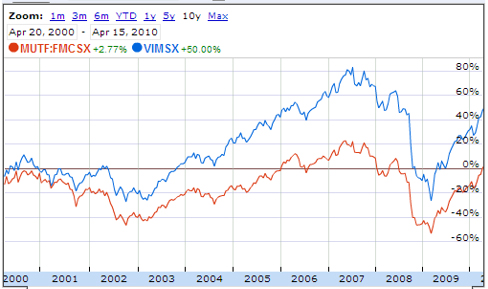
The problem with most stock comparison curves is the projected return depends critically on the starting date.
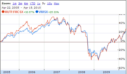
But had you invested 5 years ago, it’s a tie, which is odd since the ten year chart apparently indicated Vanguard generated the highest returns in every period, including 2005.
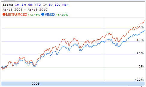
And at 1 year, the roles are reversed.
What's going on here? Why are these charts so inconsistent? Well, if one fund was unusually high or low on the exact day five years ago this chart was plotted, that atypical number is used to calculate the relative return on every date into the future. It can "slide" a weak return curve above its alternative, even if the alternate fund outperformed during the rest of those five years. Also, we tend to believe that any curve going "up and to the right" is on a positive trajectory. But as we will see, this impression is exactly contrary to the message such a plot should communicate. The conventional chart tells you only one thing- if you had purchased the fund on that one particular day in the past, each datapoint on the curve indicates what gain to expect if you sold that fund on a future day indicated on the bottom axis. But that's not a very useful statistic when trying to decide between two new possible investments- its a single point projection from the past. More likely, you want to know- on an average investing day- if one stock is likely to yield a higher return going forward. Plotted conventionally, with a starting point of four years ago, AT&T looks like it always "beats" 3M. At least it's tempting to think so based on this graph. Here, a single investment date of Jan 1 2006 is chosen four years in the past, to anchor all gains into the future:
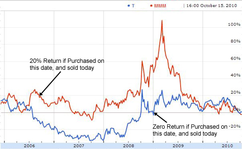
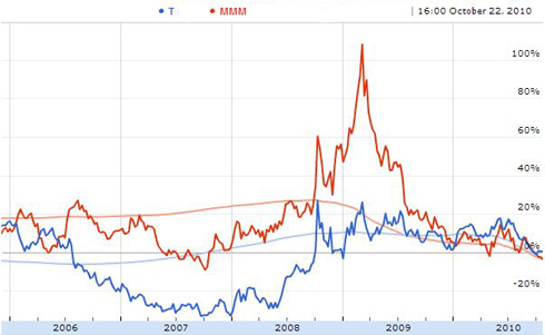
But what if we plot "backwards"? That is, plot the return you would receive TODAY, based on potentially investing on any date in the past? Here is exactly the same information, plotted backwards to the future:
To read this chart, this means had I invested in 3M during July of 2006, my gain would be nearly 20% if I'd sold "today" (October 15, 2010, the date the chart was plotted). It would have been zero if I had invested in AT&T during June of 2007. And so on. Note if you had invested on almost any random day in the last five years, 3M would have exceeded AT&T's return. Since an investor can't always know whether TODAY is at the 10, 5 or 1 year point, (i.e. comparing when you invest vs when you intend to liquidate in the future), normal comparisons are of little help when choosing a new fund. You need to know, on an average day when you might purchase this asset, if one stock will outperform the other going forward. Which a conventional plot can't reveal. But financial advisers constantly offer exactly these kind of 1, 3, 5 year historical returns as guidance! As do the funds themselves in ads or their prospectus. Here is IBM vs HPQ plotted conventionally over a five year period:
Note the returns, roughly speaking, are similar for both stocks- although HP seems to be ahead on average, except in the most recent half year. But this is an optical illusion and a misleading analysis. Notice the red IBM curve started lower and ended higher, which implies a sustained gain over time. When plotted with the BTTF approach, the difference emerges:
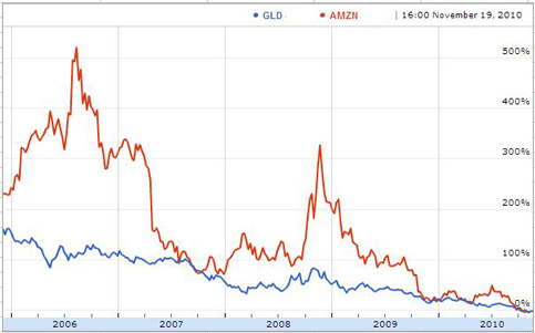
The BTTF chart screams out- IBM was a much better choice in almost every week for the past five years. A fact easily overlooked in a conventional plot. The technique is valuable even when comparing between winning investments, for example Amazon ("AMZN") and a Gold Fund ("GLD"). In a conventional five year time series plot,
they seem about evenly matched, though Amazon pulled ahead in the last quarter. But using the BTTF approach,
Clearly Amazon shines more brightly than gold..... You can also combine the BTTF technique with "dollar cost averaging". This is a way to hedge your bets against selecting the optimal time to invest, by not choosing a particular date, but instead investing a little bit every day (or week or month) from the time you first choose to buy the stock. For example, in the above plot it's clear practically any single bet on Amazon yielded more than any single bet on gold. We can ameliorate the hazards of choosing a less auspicious single date on more volatile funds, by imagining purchasing $100 of both stocks every week, and then calculating the average return from investment date to sale:
So buying $100 of stock every day for five years and selling at the end of five years would yield around 165% return for Amazon vs 65% for Gold. Beginning a dollar-cost-averaging investment program more recently yields less, and indicated by the two smooth curves. Dollar-cost averaging also benefits stocks with less stellar performance, for example, in the AT&T vs 3M comparison:
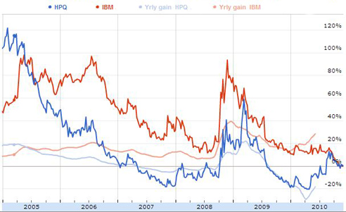
You may also find it helpful to supplement TOTAL RETURN with an effective straightline ANNUAL RETURN. This makes it easier to compare an interest bearing account or bond, which advertises a yearly return, to holding stocks over a longer period. For example, holding a stock for three years that generated a 30% total return, is equivalent to a 10% annual return (ignoring compounding, reinvesting dividends, taxes, etc.). This plot compares the annual and total return for HPQ and IBM:
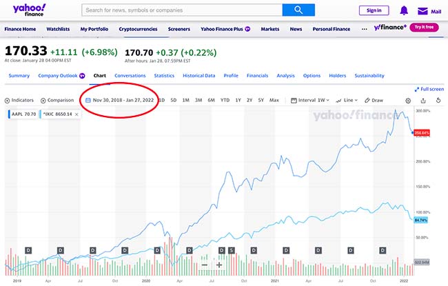
Note IBM generated a pretty consistent 10% to 15% annual return over this period. To reiterate, conventional returns- measured by throwing a dart at the past and plotting returns up to the present day- are misleadingly sensitive to the choice of starting date. My approach- the "back to the future chart" BTTF- captures the entirety of past returns for all possible starting dates. It allows you to estimate variability in returns, to compare ostensibly "similar" financial instruments, and to estimate future success more accurately. It avoids errors comparing 1, 3, 5 and YTD numbers when selecting between funds (since the rank order depends on the EXACT date, sometime the exact minute, the table is created). You still have to research the stock, be sensitive to recent market moves, and factor in the macro-economy. But compared to traditional returns tables, BTTF is a better way, and should become the new "gold" standard. Note added 2022: The BTTF function (while not advertised in those terms), is now a feature of many on-line stock picking sites, so I have retired my calculator. For example, the RANGE option at yahoo stocks:
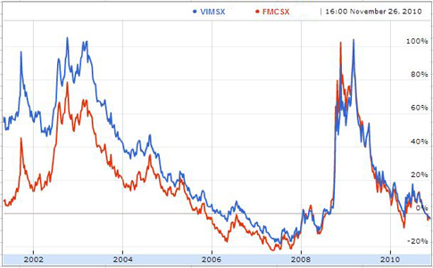
NEXT-->> Knowing when to buy and sell. ---------------------- Oh, and which mutual fund was superior? Well, applying the BTTF technique over the last ten years, its clear Vanguard beat Fidelity until 2005, but since then, it's pretty much been a tie. Perhaps they hired there new managers, or the investment criteria changed. But into the future, go for the fund with the lowest management fee.
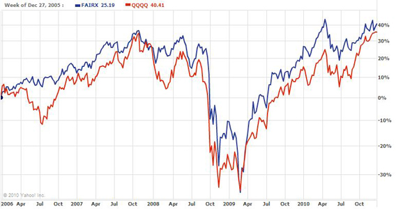
------------------------- Note added Dec 29, 2010: A friend asked me to analyze the FAIRX fund (Morningstar five star rated, more than $15B under managment), which has performed admirably. But how does it compare to QQQQ?
Or, examining a conventional load adjusted returns table:
which implies FAIRX is superior. But this is an artifact based on initial starting dates. The numbers will squirm around next month, and next quarter, ...
|
||||||||||||
Contact Greg Blonder by email here - Modified Genuine Ideas, LLC. |
